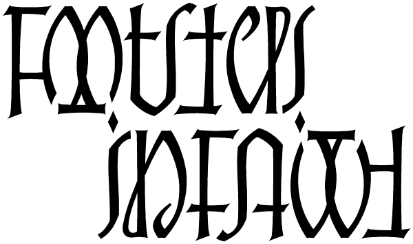
One of the things that make this ambigram work well is the fact that the crossbars of A and
F are often low in normal lettering and typography, for sound aesthetic reasons, even when the crossbars of other
letters are high. Every little thing that people are used to helps them recognize letters more easily. Also serving this design well is the old dot-the-i's trick. These things were welcome allies while I tackled the fearsome double O.
|
![]() All content of this site is Copyright © 1996-2009 Kevin Pease. All images are for viewing only and may not be used without permission.
All content of this site is Copyright © 1996-2009 Kevin Pease. All images are for viewing only and may not be used without permission.